
Bad design is expensive. Not in an abstract, hard-to-measure way — in a very direct, measurable way. Every time a user visits your website or app, has a confusing experience, and leaves without taking action, you have lost a potential customer. In Hyderabad’s increasingly competitive digital marketplace, the businesses winning online are winning partly because their product design is better.
Here are the most common UI/UX mistakes that 7Curves sees costing Hyderabad businesses real revenue and exactly how to fix each one.
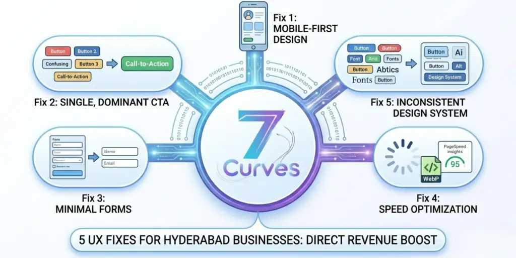
Mistake 1: Mobile Experience Treated as an Afterthought
Over 80% of internet users in India access the web primarily through a smartphone — and in Hyderabad, that figure is even higher. Yet businesses consistently present mobile users with desktop-optimised experiences that are slow to load, difficult to navigate on a touch screen, and riddled with text too small to read without zooming. The fix: mobile-first design. Every design decision — layout, button size, font size, form length, image loading — must be made with a smartphone user as the primary consideration.
Mistake 2: Too Many CTAs Competing for Attention
One of the most common conversion killers is a page that asks users to do too many things simultaneously: ‘Call Us’, ‘Book a Demo’, ‘Download Our Brochure’, ‘Subscribe to Newsletter’, ‘Follow Us on Instagram’. When everything is a priority, nothing is. The fix: every page should have one primary CTA that is visually dominant and clear. Secondary actions can exist but must be visually subordinate. On your homepage, that primary CTA is probably ‘Book a Free Consultation’ or ‘Get a Quote’. Make it unmissable.
Mistake 3: Forms That Ask for Too Much Information
Research consistently shows that every additional field in a contact or enquiry form reduces completion rates by approximately 5–10%. Hyderabad businesses routinely ask for name, email, phone, company name, company size, industry, budget range, and project description — all before a single conversation has happened. The fix: reduce your contact form to the minimum necessary fields to initiate a conversation. Name, email, and a brief requirement description is enough to get started. Collect additional information during the discovery call.
Mistake 4: Slow Loading Speeds on Indian Networks
India’s mobile network speeds, while improving significantly, still lag behind global averages in many areas — including parts of Hyderabad. If your website takes more than 3 seconds to load on a 4G connection, you are losing a significant portion of your potential customers before they even see your offering. The fix: optimise image sizes (use WebP format), implement lazy loading, use a content delivery network (CDN) with Indian edge servers, minimise JavaScript bundle sizes, and score at least 70+ on Google PageSpeed Insights Mobile.
Mistake 5: Inconsistent Design Language Across the Product
When different pages of a website — or different screens of an app — look like they were designed by different people in different decades, it destroys user trust and confidence. Inconsistent typography, mismatched colour usage, different button styles, and varying spacing patterns all signal to users (subconsciously) that the business is not professional or reliable. The fix: invest in a design system — a documented set of reusable components, colour palettes, typography scales, and spacing rules that keep every page and screen consistent.
Conclusion
Every one of these UX mistakes has a direct fix — and fixing them translates directly into better conversion rates, lower bounce rates, and more business. 7Curves provides UI/UX design services for businesses in Uppal, Hyderabad and across India — covering full product design, design system creation, and conversion rate optimisation. Book a free UX review.